
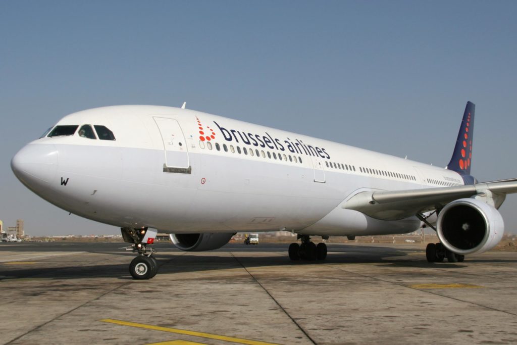
Brussels Airlines has unveiled a new logo as the airline hopes to embark on a new chapter for the company. The previous logo had been in use since 2006.
"After years marked by many changes it is important to clarify and confirm our position in the market. We are now turning our attention to the future with strategic investments, clear priorities and a strong Belgian identity," Kim Daenen, the spokesperson of Brussels Airlines, said in a statement to Aviation24.be.
The new logo reuses the red ball design of the old, reconfiguring into rows of three instead of the b design previously used. The most striking change, however, is the increased size of the word 'Brussels' in relation to the rest of the logo.
Related News
- First Brussels Airlines flight to New York was fully booked
- Brussels Airlines scraps flights because of staff shortages due to illness
- Belgian airport named best for cargo in Europe
"We see this new brand identity as a symbol of confidence in our company's future. Brussels word "brussels" gaining more importance with its larger size, we are re-emphasising our Belgian identity and our role as Belgium's home carrier," Daenen added.
The first aircraft with the new branding will be officially unveiled on 18 November.